Improving Product Discovery and Browsing
Flexible grid and filter controls that surface more products and create a cohesive website experience.
Overview
Customers were landing on category pages but not exploring. We were observing fewer product interactions, declining add-to-cart rates, and rising bounce rates. These signals pointed to a key problem:
Cognitive overload and distracting UI elements were blocking product discovery.
I led a redesign to remove these barriers and create a more focused browsing experience.
The Outcome
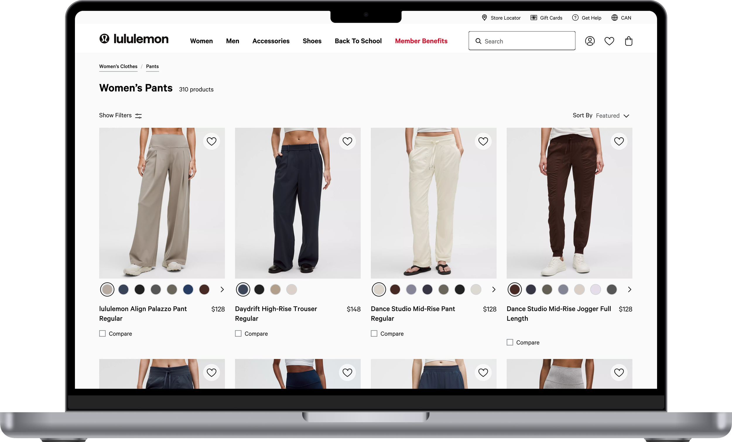
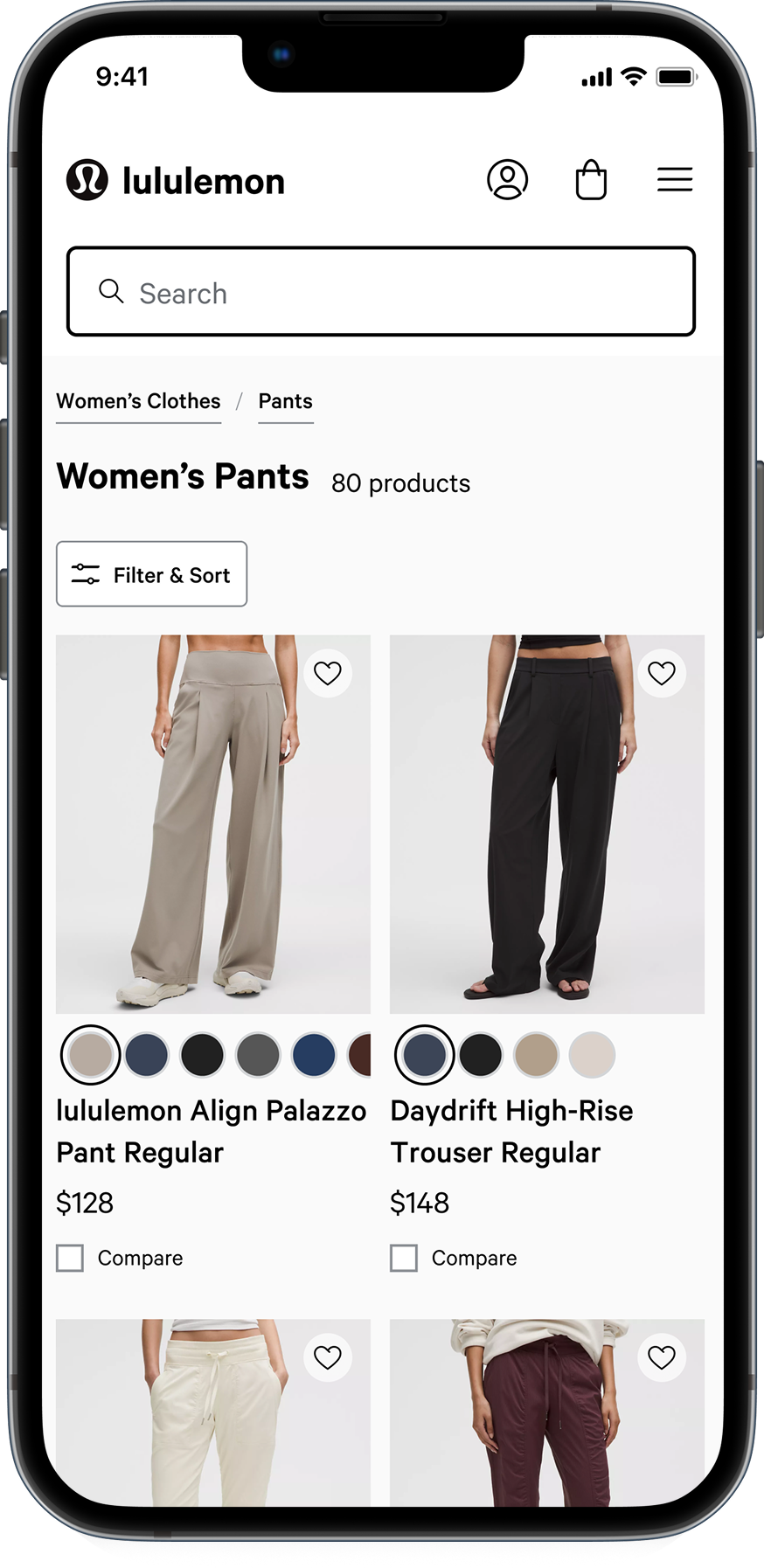
As the lead designer, I introduced a flexible product grid layout that hides filters and reduces distractions when desired. This led to a 1.8% order conversion rate increase and supported more effective discovery and comparison.
Beyond outcomes, this project was a key growth moment for me: I successfully aligned senior stakeholders around bold design changes by connecting user behavior patterns to clear business impact, building trust and confidence in the direction.
My Role
I led this project from problem definition through high-fidelity execution, working closely with product and developer partners. My responsibilities included:
Defining the problem and design direction
Stakeholder alignment
Competitive analysis
Visual and motion design
Prototyping
From Insight to Direction
Earlier vision and strategy work revealed a consistent problem. Users were struggling to navigate category pages due to cognitive load and distractions. At the same time, the business aimed to increase awareness of the expanding product assortment.
Analytics, user research, and A/B tests showed that our users are visual browsers. More filtering options helped some users but overwhelmed others.
We needed a solution that balanced clarity, flexibility, and product visibility.
This led to a clear opportunity. I prioritized a solution that gave users the ability to switch between a three or four-column product grid and hide filters when desired. This gave them greater control and made browsing more focused and effective.
Structuring a Complex Problem
In early explorations, I found our category pages had never been treated as a unified experience. Disparate issues and inconsistencies across different page types created unnecessary friction.
I broke the work into smaller, more manageable pieces and prioritized the highest-impact changes for MVP, leaving lower-impact improvements for later. This approach brought structure and clarity to a large, complex problem space.

This project was also a chance to examine all category page types alongside the search results experience. The challenge was clear: each had different layouts and patterns.


The Problems

I needed a solution that would work seamlessly with a four-column grid while also bringing greater consistency across the site.

Earning leadership buy-in
I used this project to tackle a long-standing friction point: the placement of our Buy Online, Pick Up In-Store feature. Despite minimal engagement and misalignment with research, leadership had resisted changes. I proposed moving it into the filter panel as a toggle to reduce distractions and improve logic.
By presenting clear data, design rationale, and visuals, I earned senior leadership buy-in and approval to move forward.


The Solutions
Elevating with motion design
I wanted the grid transition to feel seamless on this critical page. With limited motion design experience, I partnered with a specialist to explore four animation styles before landing on one that was smooth, easy to follow, and never distracting.
Working closely with developers ensured technical feasibility and precise implementation, strengthening both the design and my own motion skills.
Final Designs
The finished experience combines clarity, flexibility, and consistency across category pages and search results.