lululemon iOS App Notification Experience
Curating a push notification message center

Overview
This was not a typical project. It was non-linear and required navigating through ample ambiguity closely with my product partner.
The business sought to increase lululemon app personalization and push notification revenue by building a pre-determined marketing message inbox solution.
I presented my team with a different understanding of the problem space and convinced my partners we needed an alternative approach to achieve value.
The Outcome
I designed an experience that surfaces relevant push notifications on the app homepage after influencing pivoting to a user-centric strategy.
The final product improves personalization while maintaining brand trust and is expected to increase notification click through rates by 3.2% and notification opt-ins by 4%.
My Role
I led this work from early discovery through design execution. My responsibilities included:
Generative user research
Secondary research
Problem definition and UX strategy
Visual design
Interaction design
Grounding
I joined this project half way through. Discovery was done, the solution was outlined and the team expected me to begin designing.
It was clear to me this project was only shaped around a business need. Their user research had been conducted primarily to validate a pre-determined inbox solution. I didn’t think the solution was aligned with what the research revealed.
I shared my concerns with my product partner and convinced them we needed to go back to discovery to understand the problem and value opportunity.
Pivot Back to Discovery
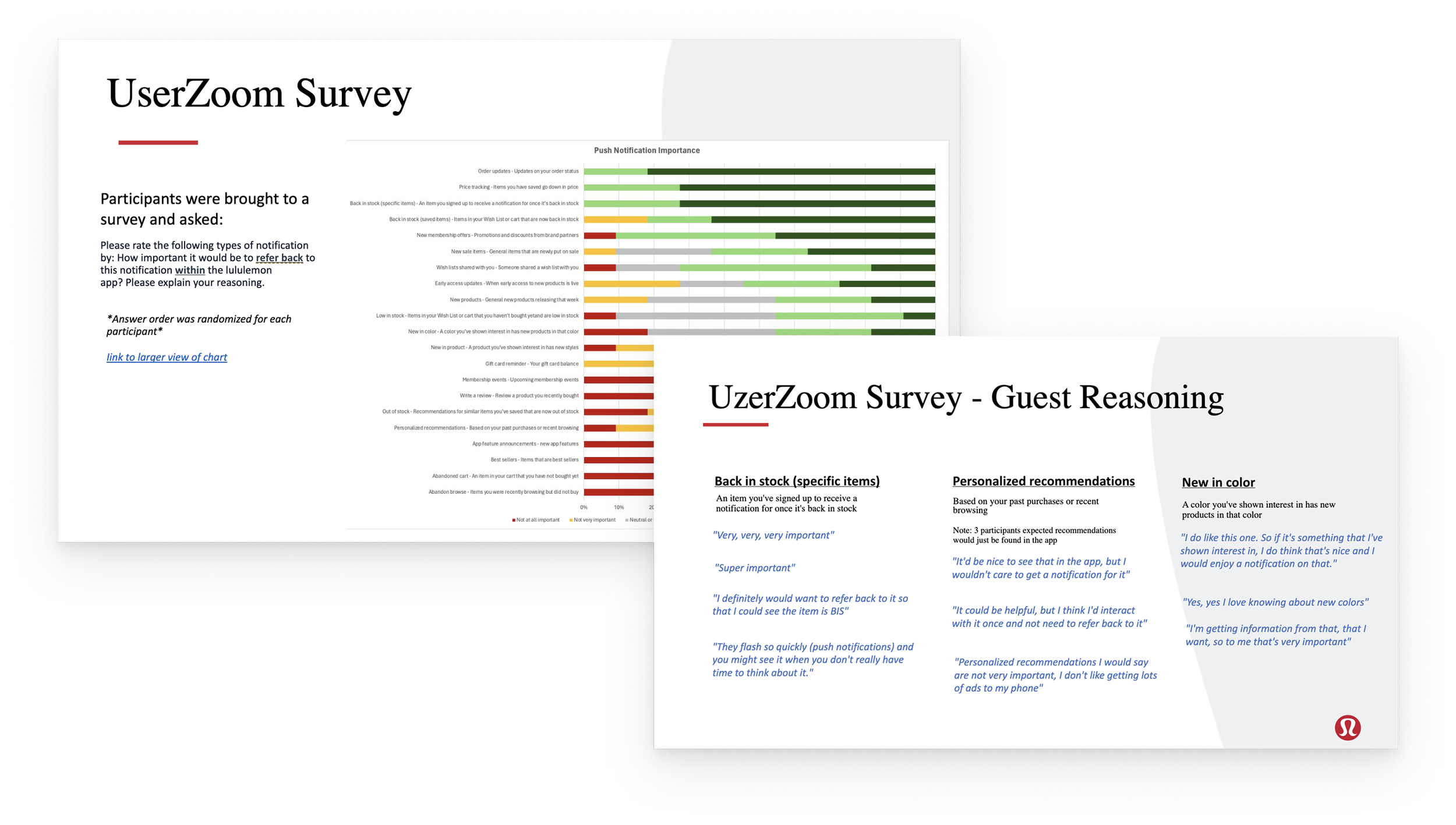
I started with running a generative user research study to understand the problem space without framing a solution.
Primary objective: Do users want to refer back to push notifications?
Secondary objective: How might we drive more push notification opt-ins?
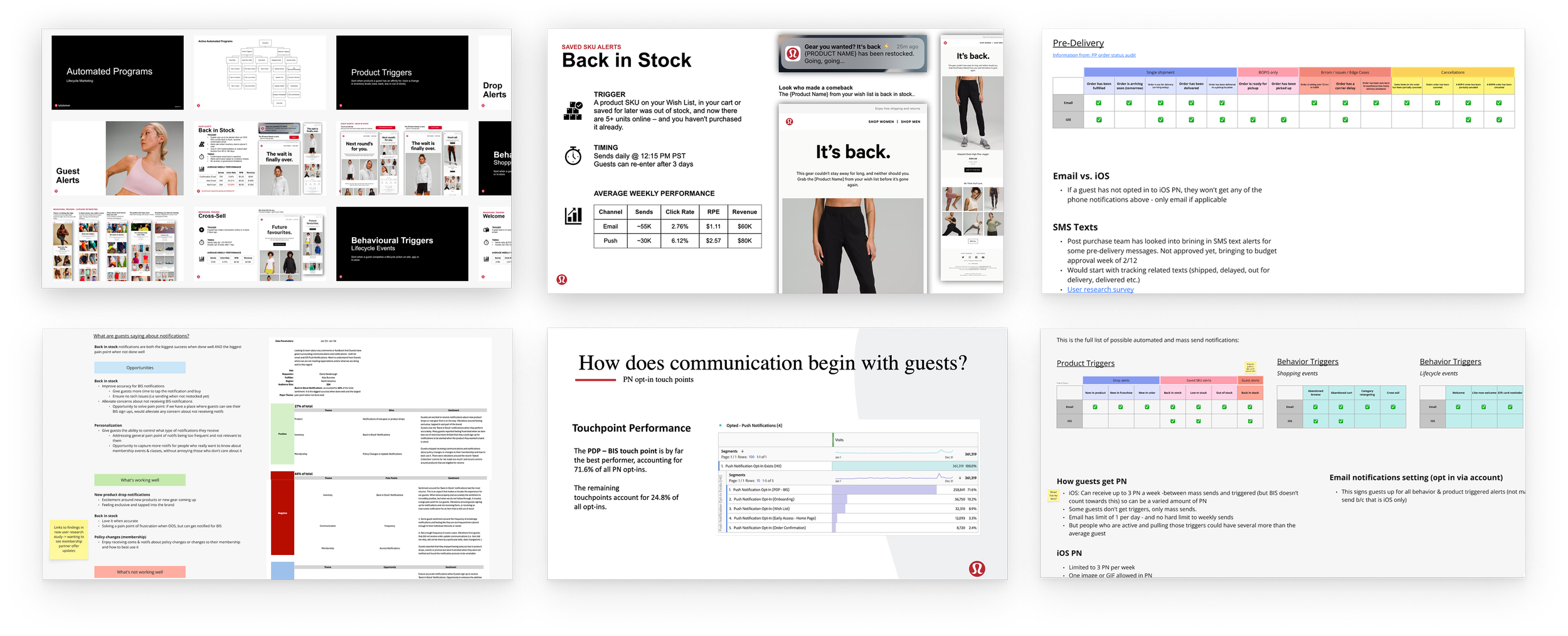
I also needed to understand the larger picture of our entire communication ecosystem with our users.
What are all the types of notifications we send?
What are users currently loving or hating about notifications?
Frequency of these notifications? Engagement data?
What are our opt-in touch points? How can guests opt-out?
Discovery Outcome
My discovery learnings provided key insights that would help this become a high-value feature and maintain brand trust.
A marketing notification inbox may not be solving a direct user problem.
However, we can create value in allowing users to refer back to certain recent notifications...if done in a tactful manner.
A New Strategy
With these new findings, I worked closely with my product partner to adapt our strategy following a fresh framework.
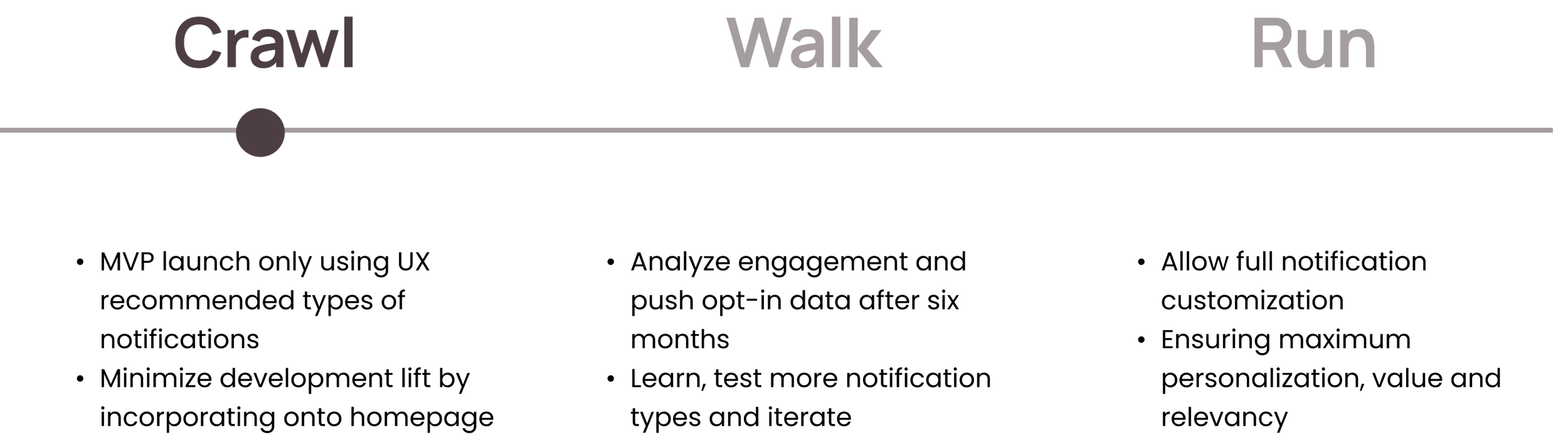
Defining: What, Where, How
What notifications
The MVP includes three types of notifications identified by the user research that were the most generally desired in order to avoid risk of “spamming”.

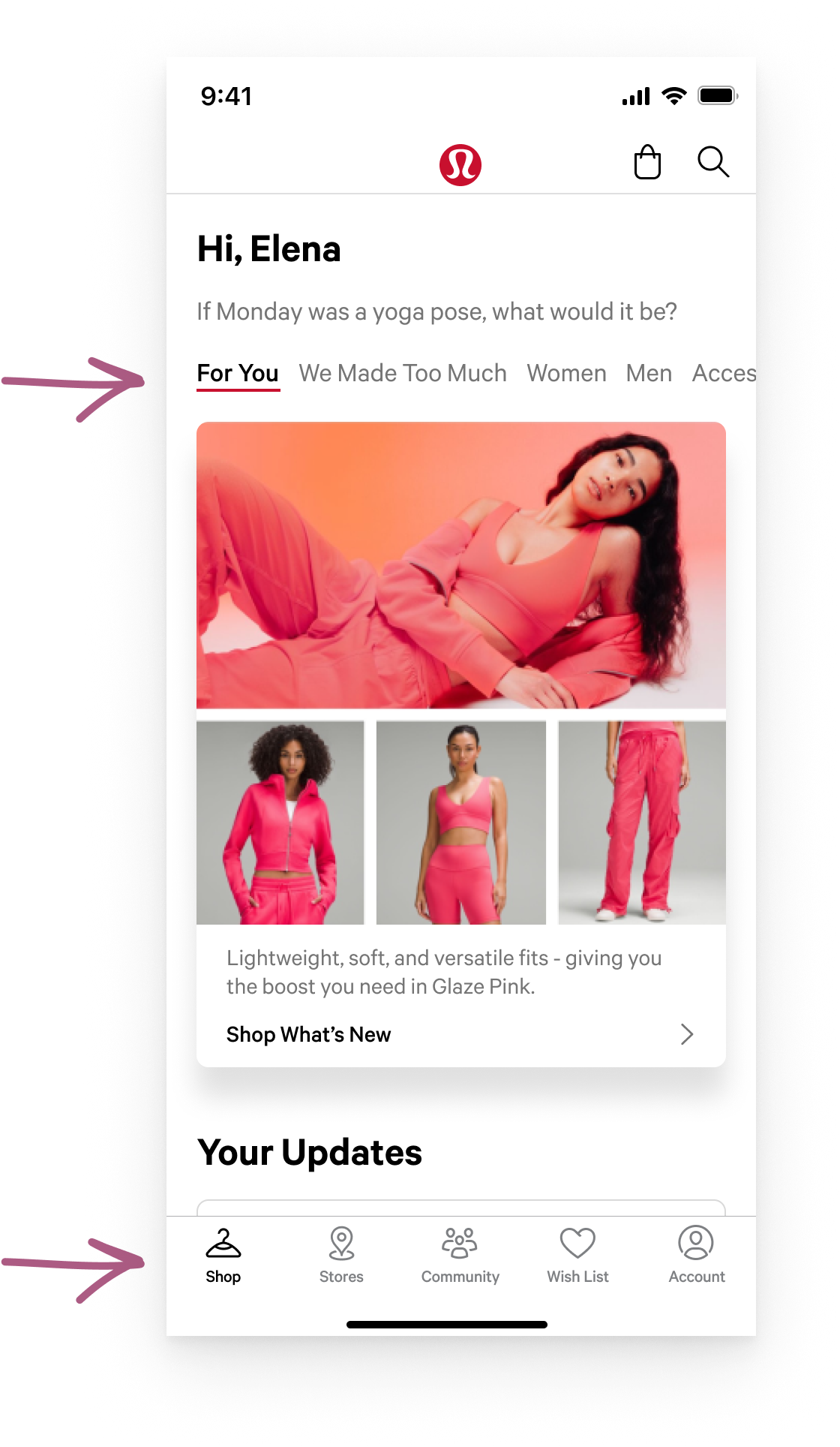
Where it lives
On the homepage, under the personalized “For You” tab which houses similar frequently updating content and aligns with user expectations.
How it behaves
I defined logic and behavior guardrails to ensure notifications present are always relevant, not overwhelming and includes desired interactions.
Final Designs
My guiding principles developed from the discovery learnings were key to addressing users needs correctly and supporting our business goals.
Avoid overwhelm
Because this feature may not be solving a direct guest problem, I wanted to use caution with amount of feature emphasis.
Keep it relevant
To showcase value and maintain brand trust.